Boost Your Mobile Audience: How to Increase Sales Growth

Boost your Mobile Audience: How to Increase Sales Growth
More and more people are using their mobile devices on a regular basis for online shopping. The majority of people still seem to use a desktop or laptop computer. However, you cannot ignore the rising number of mobile users. Because of this, you need to pay attention to how visitors are experiencing the mobile version of your website. You may be wondering how to increase sales growth and if it has anything to do with your bounce rate. By improving your customers’ retention, you can get more interest and more sales.
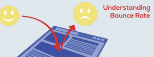
You should make sure to check your bounce rate regularly. Bounce rate is the percentage of people who visit your site, only to leave it shortly after.
There are many reasons for what could affect your stats, but one of the major one is speed. People are much more likely to leave your site if they are given long loading times. In many cases, too long of a wait can be a matter of seconds, which is why it is important to optimize your website for speed.
If you notice a higher bounce rate than usual, it could be a problem with your mobile users. If you have too much data for a phone’s processor to handle, it could take a longer time for pages to load. Code for mobile pages need to be concise and as minimal as possible when it comes to downloadable content. Ads can also be weighing down your load time, which is tricky business. You may rely on ads to make money, but the time it takes to process them could be driving potential customers away.

How to Measure Mobile-Friendliness
In order to find out if the mobile version of your website needs an upgrade, you have to check if it is mobile-friendly. Mobile-friendliness refers to how easy it is to use and navigate a site on mobile devices. There are quite a few factors that go into usability.
People have to be able to use your site on any device (whether it be iOS, Android, or Windows), with any browser (Internet Explorer, Chrome, Firefox, etc.) at a reasonable speed. Being inclusive for all users is important for making sure that anyone can access your site so that you can get as much traffic as possible.

A good tool to check your site for mobile efficiency is a quick test by Google. It takes less than a minute and gives you results that explain the areas your website makes the cut and where it doesn’t. It also provides resources for getting on the right track to achieving the best usability. Using their tips can be very helpful. They even have a discussion group for you to involve yourself with other site designers.
Make Improvements to Your Mobile Site
If Google’s test reveals that your website is not as efficient as you would hope, you need to take measures to improve it. You may need to change the navigation to make it simpler for mobile devices. Shrinking the size of large files may necessary so pages can load faster.
You may even need to remove some functions altogether so that it can become a more user-friendly experience. As long as the main components remain, you can keep the integrity of your site without compromising its purpose.

Using AMP
You have to be especially wary in terms of speed. According to Google’s blog, Think with Google, the typical U.S. retail site loads in about 6.9 seconds on mobile devices. 40% of visitors will leave a page after 3 seconds of waiting. This is huge for retailers. They could be losing out on a lot of money just because they did not optimize their page for mobile devices. You do not want to be on the wrong side of these statistics.
Luckily, there are ways to code for mobile pages that are specifically for making them faster. These are accelerated mobile pages (AMP) and they are meant to speed up loading times to make websites more readily available.
If you are familiar with HTML, then AMP should not be terribly difficult for you to get on board with. You can use AMP in addition to HTML, with more designated tags and restrictions so that you have a clearer guideline.
Once you make your online shop mobile-friendly, you will find that consumers will stay on your page for longer periods of time. This will create an opportunity for more sales, and happier customers so that they may come back for more.
Sign up to receive our digital catalog.
[contact-form-7 id=”5741″ title=”Front Page Subscribe”]
Related


