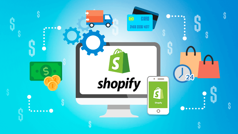
The Ultimate Guide to Shopify Website Design

Before launching a Shopify store, you have to make sure the design and user experience (UX) are optimized. This will drive sales and turn one-time visitors into regular customers.
In fact, good Shopify website design is crucial to good UX – they complement one another and work as a whole. You can’t have one without the other, so it’s always important to imagine how to give the user what they want (or need) from your online store.
The phrases website design or store design are interchangeable in this post. They can also refer to a variety of things – anything from the color scheme to the navigation bar to the layout of your Shopify store.
That being said, every part is important and every bit is crucial. You need to look at the website design for your Shopify store holistically.
In this post, we’ll take a look at how website design and UX are connected, how they complement each other, and how they benefit you.
We’ll also go over the best practices and tips for building a Shopify store that maximizes profits. That way, you can boost conversions and nab those much-needed sales!
- Why Is User Experience Critical for Ecommerce?
- Design Tips For Your Shopify Store
- Choose The GreenDropShip Dropshipping App For Shopify
Why Is User Experience Critical for Ecommerce?
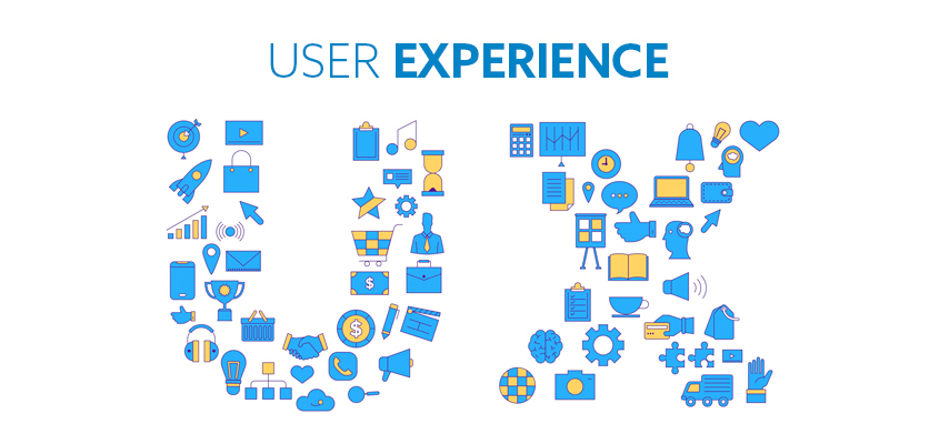
Before we dive into why great Shopify website design is so vital to your success as a merchant, let’s learn a little about user experience (UX). This is how a consumer subjectively experiences, perceives, or interacts with a product or service, including websites and online stores.
According to Forbes, good user experience (UX) can boost conversion rates by a staggering 400%! You can probably see why negative UX can really sabotage your store and kill off any profits – as a Shopify merchant, you need to avoid it like the plague.
The name of the game is to always have positive UX and you’ll reap plenty of benefits, especially if you couple it with great design.
Now, let’s talk a little about positive UX and Shopify website design. It should come as no surprise that people make quick judgments about what they like or dislike, but you may be surprised just how quickly this happens.
According to research from Google, it takes less than half a second for people to form a first impression of a website’s design and aesthetics. It’s that fast!
Additionally, 94% of the time, negative first impressions of an online store are related to poor design, with people claiming that the following factors influence their negative reactions:
- Too complicated
- Cluttered/busy layout
- Poor navigation
- Boring page design
- Clashing colors
- Too many pop-up adverts
- Slow loading time
- Too much text
- Font too small
- Generic copy
You need to avoid all of these potential mistakes at all costs when designing your Shopify store.
We’ve gone over the mistakes that you can make, so let’s take a look at some of the benefits of great Shopify website design:
1) Improves conversion rates
Conversion is a pretty broad term that’s frequently used in Ecommerce. It refers to the action you want the website visitors to take, ranging from subscribing to the email list to buying something. In other words, conversion is the ultimate goal!
When it comes to your Shopify store, the customer buying something is the ultimate conversion – that’s the whole reason you designed your Shopify store. The only trick is getting them to do it, which is sometimes easier said than done.
In this context, the conversion rate is the percentage of visitors who made a purchase, and conversion rate optimization (CRO) is everything you can do to improve your Shopify conversion rate. CRO includes all the strategies and tools to get online shoppers to hit that Buy Now or Add to Cart button.
If you want to have a great conversion rate, then you need to design a great Shopify store that keeps online shoppers browsing.
Ultimately, online shopping is a bit like being in a casino – the longer a person stays in your store, the more likely they are to buy something. And it’s easier to get someone to stay if they’re having a positive experience.
In fact, good design and UX have the power to:
- Increase click-through rates (CTRs)
- Boost conversion rates
- Decrease bounce rates
The phrase “good design and UX” can mean all kinds of things, from easy navigation to fast loading times to a pleasing color scheme. It’s important to remember that it’s the whole package – it all needs to come together just right to give that positive UX.
According to research by KissMetrics, 42% of online shoppers base their opinion of a website just on design and 52% won’t return if it has poor aesthetics.
2) Encourages customers to spend more

Getting customers to convert is already a big challenge, but once they’ve made that decision then it’s possible to encourage them into spending more. This is also known as increasing the average order value (AOV).
Good design and UX can help increase the AOV and get customers to actually buy more. This is partly because consumers simply like browsing or “window shopping” at a well-designed store – there is inherent value in that activity.
Remember our analogy with the casino: the longer they stay, the more they spend!
You can also get customers to spend more via certain strategies when designing your Shopify website, including:
- Upselling certain products if you have a more expensive version available.
- Cross-selling related items by including People Often Buy or You May Also Like sections.
- Motivating purchases with limited-time offers or showing how much is left in stock.
- Creating a sense of urgency by including a countdown timer at checkout.
- Offering free shipping once they’ve purchased a certain amount.
- Installing a currency converter for online shoppers in other countries.
All of these strategies can be implemented with Shopify design apps that expand and customize Shopify themes. This includes both page builder apps and push notifications apps, depending on how much you want to customize your underlying theme.
3) Establishes trust with online shoppers

We may not like to admit it, but we all judge a book by its cover. It’s a natural part of human interaction and it even affects how much we trust websites.
According to the Aesthetic-Usability effect, beautiful and well-designed things are perceived to be easier to use, more trustworthy, and more valuable than unsightly or poorly designed ones.
Establishing trust is vital if you want to make sales and boost conversions. There are several ways to achieve this, but consistency in your design and UX are key, so always make sure you:
- Use the same tone across all the copy (conversational, friendly, etc).
- Choose a color scheme, keep it consistent, and avoid clashing colors.
- Make sure your landing page fits and complements your brand identity.
- Keep all messaging smart, clear, and simple.
- Add trust signals like reviews, contact info, and third-party badges/certifications.
It’s also important that you give your Shopify store that special, human touch. People like to know that there’s a person on the other end of the internet connection, so let everyone behind your brand shine and share their stories with consumers.
This is best achieved with an About Us page or regular blog posts, both of which can be easily designed with Shopify design apps.
Finally, transparency is extremely important. One study found that 94% of consumers are more likely to stay loyal to brands that offer complete transparency.
When it comes to your Shopify store, the biggest mistake you can make is suddenly adding hidden fees during the checkout process. Consumers view this as untrustworthy and will abandon their carts in record numbers.
4) Effectively builds your brand
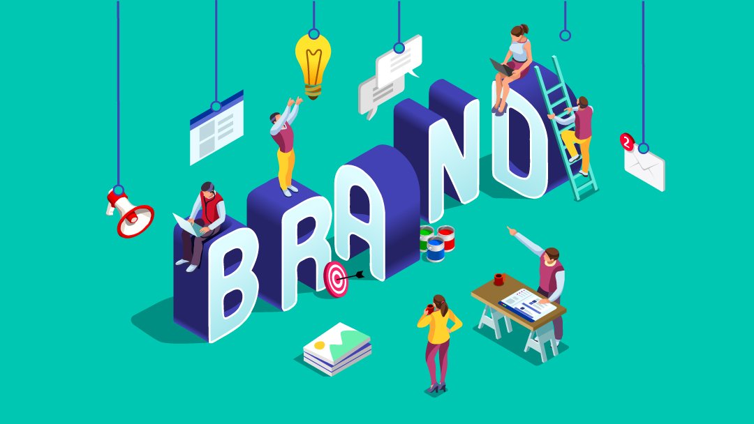
Great website design and UX for your Shopify store also have the power to effectively build your brand, as long as you make the right choices!
Remember that consumers have a “gut instinct” on whether they like a brand or not – they may not even be able to tell you why they like or dislike something. They just feel it.
Don’t forget the Aesthetic-Usability Effect that we discussed above – if you design something well, then people will value it more. This means that their gut instinct will be to like your brand or store – they’ll feel it and it will influence their decision to buy.
To keep UX positive and maximize your design, here are some basic tips and best practices for Shopify website design that can positively build your brand identitiy:
- Pick the right color – they tap directly into consumers’ emotions and instincts.
- Maintain this color scheme and make sure 3rd party additions also fit the aesthetic.
- Inject a little personality and remind consumers that there’s a person on the other end.
- Target consumers’ emotions and feelings since gut instinct affect purchasing behavior.
- Present a clear and concise unique selling proposition right on your landing page.
- Include your brand logo throughout the Shopify store and across all devices.
- Make your brand unique – it’s like that old saying: Just be yourself.
Let’s just take a quick look at an example: the Adidas Store.
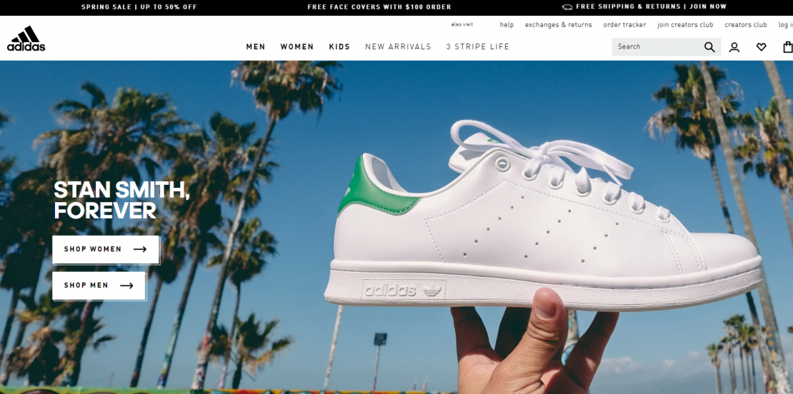
You’ll see that it conveys energy, vitality, athleticism, and trendiness. All the design elements – including copy, images, and video – as well as the UX are working towards conveying two simple messages:
- Adidas is a trendy/vibrant company.
- You can feel fresh, trendy, and vibrant too.
This is an excellent example of how great store design and UX can give you a comprehensive experience that immediately conveys what consumers should know about your brand – this is who we are and this is what we do.
You can use the Adidas design and UX example as a guide or inspiration for developing your own brand identity.
Design Tips For Your Shopify Store
We’ve established that not only are design and user experience (UX) related, but they actually complement each other and – if done well – can help make your Shopify website successful. They’re both extremely important and should be equally emphasized when building your store.
If it’s easier to picture, we can break these dynamic relationships down in the following way: Good design = Good UX, and then Good UX = Higher conversion rates, higher click-through rates, and lower bounce rates.
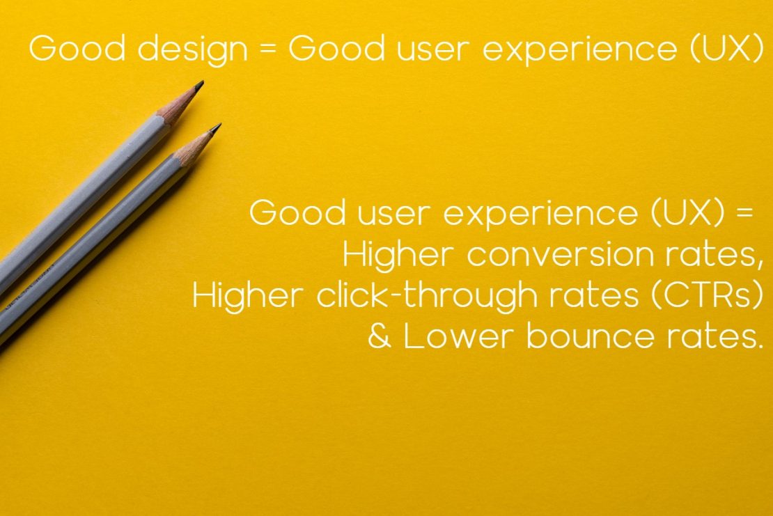
All three of those results are important, not just the higher conversion rate. For instance, lower bounce rates mean that people stay on your website longer.
If you recall, this is critical for higher conversion rates because the longer online shoppers stay, the more likely they are to buy something. As we said, it’s pretty similar to how casinos keep people gambling.
These are all related, meaning that you have to treat website design and UX as a holistic project. All of these various parts are important and complement one another, so don’t neglect one while shifting your focus to another.
Remember, keep the big picture in mind: you want to create a Shopify store that people want to visit and stay on.
That’s why there are so many Shopify design apps available. They do all kinds of amazing things for your store, but first, you’ll have to understand the fundamentals of good design.
Besides, what good are these amazing tools if you’re not certain how to use them?
That being said, here are some tips and best website design practices for your Shopify store.
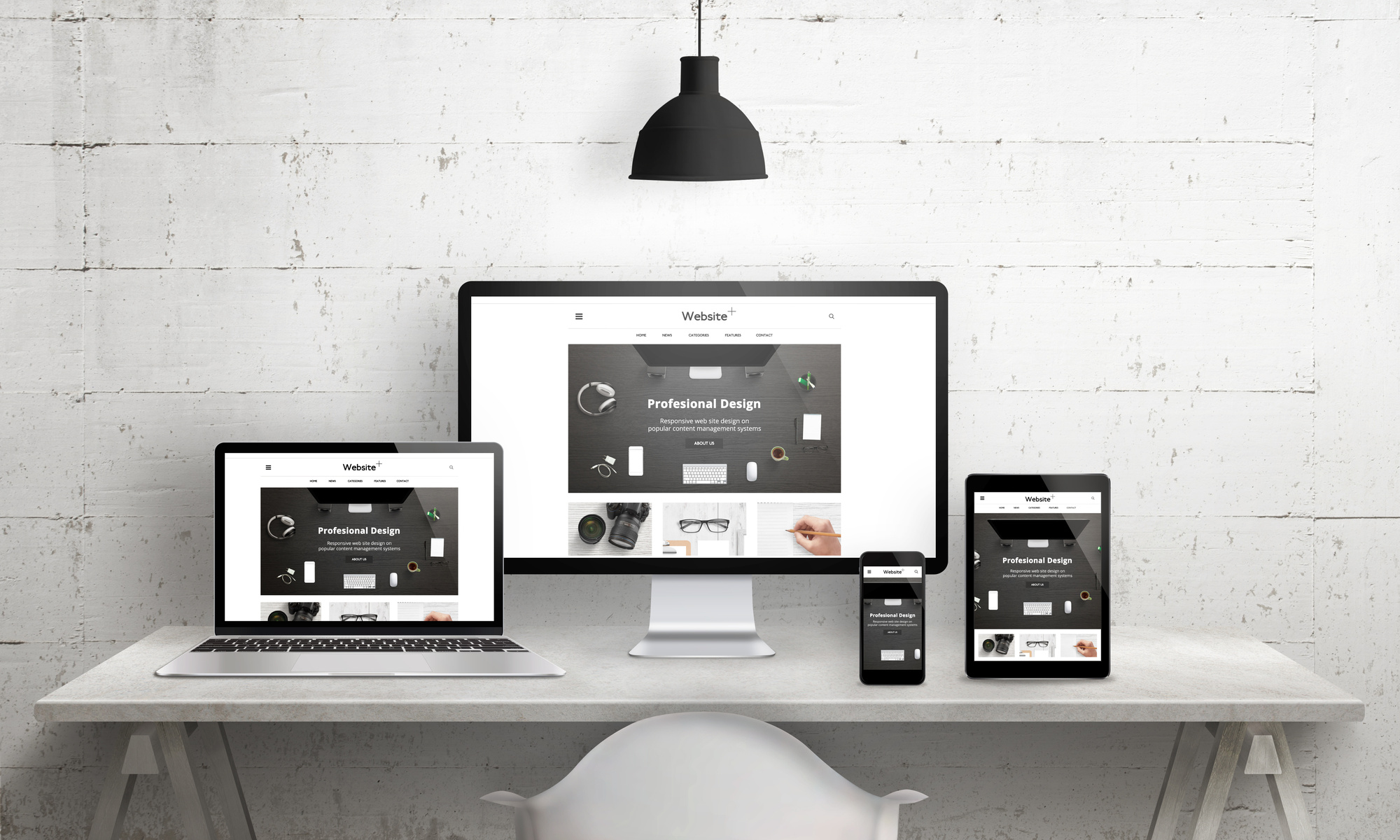
1) Make sure your Shopify website is mobile-friendly

Nowadays, Shopify website design must be mobile-friendly since so many consumers use their smartphones to shop online.
For example, online sales are projected to reach $3.56 trillion in 2021 – a 22.3% increase from 2017. Plus, according to data in 2020, nearly 80% of online sales were on smartphones.
Despite the growing trend, mobile commerce still doesn’t have the best reputation when it comes to UX, security, and convenience. According to 2020 data from DynamicYield, only 12% of consumers think mobile shopping is convenient and are 4 times more likely to think desktops are more convenient.
This means that there’s a lot of room for improvement in mobile website design and UX.
In fact, Luke Wroblewski, the product director at Google, has even developed a design philosophy known as Mobile First. This means that – rather than treating it as an afterthought – designers should focus on mobile design, even prioritizing it over desktop devices.
Shopify merchants should always make sure that their website is optimized for mobile use. You can do this in several ways, including:
- Make sure shoppers can use their thumbs – tap targets should be at least 48 pixels wide.
- Separate your different tap targets by at least 32 pixels of space (usually white).
- Featured collection products should be listed vertically (not horizontally).
- Maintain a single level of nested content for your navigational menus.
- Limit the number of navigational layers – this will improve rankings and bounce rate.
- Include a toggle menu button so the user can expand/collapse menus.
- Pick large fonts that are easy to read – between 14 and 16 pixels works best.
- Make your call to action (CTA) buttons highly visible and easy to tap.
- Keep the main navigation bar visible with a CTA, homepage link, and checkout link.
You can also use Shopify design apps and/or themes that have responsive web design, meaning they’ll resize design elements for multiple devices, including mobile.
You can also make your Shopify website blazing fast on smartphones with Accelerated Mobile Pages (AMP) apps or turn your Shopify store into a slick and user-friendly app with Progressive Web Apps (PWA), giving online shoppers the optimal UX and keeping them browsing for longer.
2) Choose the right Shopify theme
When it comes to designing your Shopify website, a theme is like a template for building your store with no web design experience. They’re meant to be a convenient and intuitive way to easily see what your store will look like and how it will function without any knowledge of coding.
Of course, if you want to manually edit the theme, Shopify provides access to the HTML, CSS, and Fluid (Shopify’s code).
Your choice of theme depends on the type of products you sell and your brand identity – the Shopify theme store has 70+ variations that you can choose from, with everything from funky and fun to luxurious and sleek.
Most of these themes have to be purchased, but there are a few free ones available. You could also try a third-party marketplace like Template Monster with 1,000+ Shopify themes, including ones like:
- Booster – you can see some of the demo stores here and here.
- Universe – there are three demo stores: Earth, Mars, and Jupiter.
- Debutify – they have a demo store for you to look at here.
- Dropship Theme – there’s a demo store available here.
These all work especially well for a Shopify dropshipping store and give you more options for great design and UX. However, they’re from third-party developers, so they’re not always guaranteed to fully integrate with Shopify design apps.
Each Shopify theme allows you to do some basic customization to improve your website design and UX, including:
- Uploading your logo
- Changing colors or fonts
- Writing original product pages
- Selecting the number of items on each line of the collection
- Embedding simple widgets
If you want even more options when designing your Shopify store and the ability to really make your store unique, then you can use Shopify page builder apps to build just about every kind of page you’d need for your store.
You can build entire stores with a drag-and-drop interface that gives you the ability to add, move, or change nearly every design element.
3) Pay attention to the colors

As the great painter Wassily Kandisnky said: Color is a power which directly influences the soul. Colors influence emotion and subconscious thought, both of which are at the core of our decision-making process.
According to WebpageFX, people make a subconscious judgment about your site within 90 seconds, and up to 90% of that judgment is based on color alone.
Plus, based on research from Kissmetrics, color can increase brand recognition by up to 80% with consumers!
All this makes your color scheme one of the most important website design choices for your Shopify store, so you’ll have to give real consideration to how you want the color to complement your design/UX and build your brand identity.
Kissmetrics also offers the following guidelines about color selection, depending on the nature of your Shopify store:
- Yellow: Optimistic/youthful, great at catching the attention of window shoppers.
- Red: Energetic, creates a sense of urgency, especially for discounted items.
- Blue: Trustworthy, frequently used for buttons that require a sense of security.
- Orange: Vibrant, convey an urgent CTA to subscribe, buy, or add to cart.
- Pink: Feminine, used to market products for women or young girls.
- Black: Powerful/sophisticated, used for websites with luxury products.
- Purple: Soothing/calming, frequently used for beauty or anti-aging products.
It’s not just the colors alone that are important – the combination also plays a huge role in good website design.
First of all, you should always avoid clashing colors and try not to make it too aggressively bright (consumer feels overwhelmed) or dark (consumer can’t read the copy/CTAs). It’s also important to choose colors that complement each other and effectively convey your brand identity.
Let’s take a look at another example: the Apple Store.
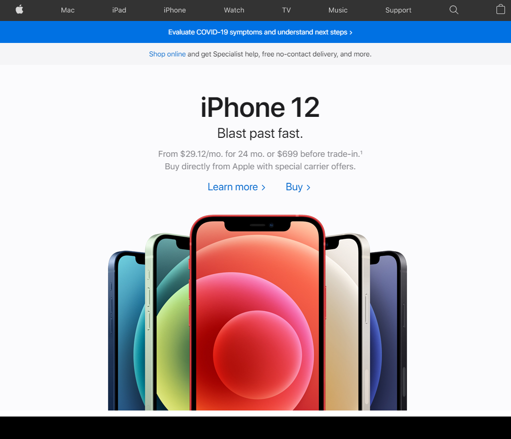
It has a minimalist design with few colors, usually some combination of black, white, and silver/grey with royal blue used for CTA buttons.
This fits Apple’s brand identity: luxury and sophistication for consumers with premium tastes. The minimalist design and subdued (but strong) color scheme support this identity and only the CTAs draw much attention to themselves.
4) Optimize the checkout process
The checkout process should always be simple and straightforward. That’s because this is the most delicate and fragile part of the entire sales funnel.
According to research in 2019, the average rate for cart abandonment in Shopify stores was a whopping 77.13%! This means most customers browse a store, fill up their cart, and then just leave.
Other studies have identified the main reasons why shoppers leave before checkout is complete:
- Hidden costs that pop up at the end.
- Overly complicated checkout process.
- Lack of trust in the website.
Avoid these like the plague! They’ll kill your conversion rate. The checkout process is the crux of the entire design and UX of your Shopify website – this is where you have to “seal the deal”, so to speak.
Because customers frequently abandon their carts, you should always optimize your checkout to maximize conversions with the following tips:
- Customize the checkout page to include your logo and color scheme.
- Use Shopify Payments or an integrated payment gateway like PayPal or Apple Pay.
- Make the progress bar more visible when customizing your Shopify theme.
- Use Card Badges to show the cards you accept and increase consumer trust.
- Add a Why Choose Us? section with satisfaction and shipping badges.
- Be 100% transparent about shipping costs (no hidden fees).
- Show the final price of all products/shipping in your cart.
- Add a countdown timer to add a sense of urgency.
You’ll see this phrase a lot when discussing Shopify website design: create a sense of urgency.
You should create this sense of urgency at every level that you can, but the checkout process is when you can really tap into that primal fear that so many of us share: the fear of missing out, also known as FOMO. No one likes to feel like they’ve just missed out on a great opportunity!
To change the theme and customize the layout or colors, you can use a page builder app to tweak design elements.
You can also use a push notifications app to add a countdown timer or customize notifications for discounts, gathering shoppers’ emails, creating new accounts, or designing email campaigns to re-engage shoppers who have abandoned their carts.
5) Place your cart at the top right corner

Take a moment to think about it: nearly every Ecommerce store has the shopping cart at the top right and their logo/navigation at the top left.
This is an interesting convention that’s pretty much set in stone by now, although it was started in the late ’90s by Amazon when many of the web design best practices were first being developed.
Why was the shopping cart first placed there? First of all, this has to do with scan patterns and how people read web pages.
According to research by the Nielsen Group, people almost always browse in an F-pattern and start scanning from left to right, including on mobile devices. As a result, early web developers used the left side of the screen to stack navigation and page info.
Once Amazon started following this layout, the rest of the online retail industry followed suit. Now that it’s been done this way for over two decades, consumers are conditioned to look for the cart in the top right corner.
Because people follow the F-pattern so consistently, it’s a good idea to have CTA buttons (Buy Now, Add to Cart, etc.) in vibrant colors to encourage scanning the eye over.
Once the consumer adds it to the cart, make sure you have a notification confirming their action and then they’ll know to look at the cart in the top right.
You can also use design apps that let you customize the cart, including making it “sticky” so that it’s easy for online shoppers to look in the cart and even edit items without having to scroll very far up the page.
If you’re looking to really customize your Shopify website design and make an ultra-unique store, do not deviate from this top-right cart placement! If you do, you run the risk of losing conversions if customers can’t easily navigate your website or they feel that something is “off” and bounce away.
6) Design landing pages that convert

You’ve probably heard the old saying: you only get one chance to make a good impression. Landing pages – arguably the most important part of your entire Shopify store – are your one chance to make a great first impression, so make sure you take full advantage.
They’re the virtual equivalent of walking through the front doors of a regular brick-and-mortar store.
If you walk in and notice that everything is messy, the staff are napping behind the registers, and there’s junk all over the place, then you’ll almost certainly turn around and walk out. First impressions are important, so make sure you take extra care to design your landing page.
Considering how much they can boost conversions, landing pages have to accomplish a lot quickly and with limited space. You can’t bombard the consumer with a huge block of text or tons of media. In other words: Get to the point!
This is crucial, so make sure you answer these questions:
- What are you selling?
- What does it do?
- How does it help the customer?
- What problem does it solve?
- Why should they buy it?
You always need to create a sense of urgency: why does the consumer need the product and why do they need it now? Plus, make sure that there’s a call to action (CTA) and that the entire landing page is focused on getting the consumer to click it.
In other words, the landing page only has one objective: get the conversion! The landing page headline/title is just as important – it’s actually the one piece of copy that you know 99.9% of online shoppers will read.
As with all other website design elements, you should focus on how the product will improve the consumer’s life. In other words, use a benefit-oriented headline, not a feature-oriented headline.
Finally, high-converting landing pages usually have supporting elements that build trust with the consumer, including testimonials and/or security badges.
Designing high-converting landing pages is easy with Shopify design apps – in fact, you can design the entire Shopify store, from the ground up, with a drag-and-drop interface. This means you don’t need any substantial web design or coding experience.
7) Add call to action (CTA) buttons
Your call to action (CTA) buttons are absolutely crucial – these trigger the conversion and help guide consumers down the sales funnel. You need to make them pop and stand out so consumers just naturally look at them.
They should basically be saying: Hey! Hey! Over here! Look at me! You need to click me!
All the best CTAs will follow what I like to call The 3 Cs:
- Clear
- Concise
- Conversational
This means that consumers need to see the CTA, it shouldn’t take up too much valuable real estate (especially on the landing page), and always try to add a human touch to your Shopify store. Online shoppers respond positively to conversational copy, as long as it’s appropriate and fits your brand.
Additionally, make sure you follow these basic CTA guidelines:
- Add a CTA to every section, not just the landing page (make it “sticky”).
- Focus on one CTA per page, especially on the landing page.
- Make the color contrast with your theme so that it clearly stands out.
- Make the CTA more value-oriented and focus on benefits to the consumer.
- Place below the fold for complex/long content.
- Place above the fold for leaner/sleeker content.
- Use phrases like Buy Now or Add to Cart for purchasing items.
Being specific with your CTAs can make a huge difference. For example, there’s a famous case study from Unbounce that compared/contrasted two different CTAs:
- Original CTA – Get your membership.
- Revised CTA – Find your gym & get a membership.
The revised version performed significantly better – there were 68% more conversions with that CTA! Even a simple change of phrasing can make a huge difference.
Designing high-converting CTAs is crucial for effective Shopify website design, so make sure you use design apps that allow you to customize everything you need for your CTAs, including content, placement, color, and “stickiness” level.
8) Avoid a cluttered layout
Great Shopify website design is all about great UX – give the customers a great experience and they’ll stick around until they buy something.
Remember the Aesthetic-Usability Effect: consumers prefer things that are well-designed, so there’s inherent value in making your store aesthetically pleasing.
In most cases, consumers know right away if they like or dislike a store, and they’re far more likely to shop at a store they find visually pleasing. Part of this is reducing clutter, especially on mobile devices.
If you’re relying on a theme with responsive design, it can become slow and sluggish if there’s too much clutter that it needs to resize for smaller mobile screens.
Plus, good design is all about guiding consumers’ eyes where you want them to go and communicating what’s important. A cluttered layout completely derails this and the consumer has no idea where to look!
Here are some Shopify website design best practices for avoiding clutter:
- Embrace white space – it makes organization easy and visually pleasing.
- Start with a clean Shopify theme, even if you’re going to customize with design apps.
- Remove backgrounds from photos and make them white or transparent.
- Keep your navigation simple – emphasize just the essentials.
- Create a masthead that’s easy to navigate and clear, without being overbearing.
- Add tabs for your product details (description, specs, shipping, etc).
- Choose your font carefully and stick with a sans serif option.
- Avoid turning on every feature that’s included with your Shopify theme.
Shopify page builder apps make it easy to carefully consider every one of these elements, even if you’re working off a preexisting template.
The best website design apps will have full integration with official Shopify themes as well as other apps, so you can customize as much as you want and keep your design clean.
9) Keep loading times fast
Online shoppers are used to near-instant gratification nowadays. They want to see your store, and they want to see it fast.
No one’s got time to sit around and wait for pages to load, like in the days of dial-up modems when surfing the web was more like crawling the web.
That simply won’t cut it these days. In fact, according to Google research, as page load time goes from 1 second to:
- 3 seconds – the bounce rate increases 32%.
- 5 seconds – the bounce rate increases 90%.
- 6 seconds – the bounce rate increases 106%.
- 10 seconds – the bounce rate increases 123%.
Hopefully, these figures are eye-opening – they clearly show how important loading times are, so make sure your website design keeps your Shopify store fast.
There are different ways to achieve short loading times, including:
- Use Accelerated Mobile Pages (AMP) apps to make your website lightning fast.
- Compress images (JPEG, PNG, GIF) with either Crush.pics or Image Optimizer.
- Choose an ultra-responsive theme from Shopify and download the updates.
- Activate lazy loading by editing the Shopify theme with or without an app.
- Minimize redirects by using the built-in URL redirect function in your admin.
- Fix broken links with free tools like Broken Link Checker and Xenu.
- Limit the number of apps installed as they add Java/CSS files.
- Avoid sliders – instead, use a Hero Layout image with a clear CTA.
- Test your mobile site speed with PageSpeed Insights, a Google Labs tool.
While many Shopify design apps improve loading times, only AMP apps are custom-designed to make your store faster on mobile.
Never underestimate the importance of loading speed when designing your Shopify website. In fact, it can make or break your store!
10) Use A/B testing to measure design performance
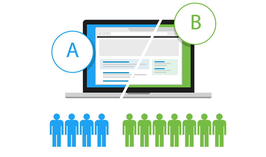
A/B testing (split-testing) is when you take two versions of a website and then test how well they perform with online shoppers.
If you’re using this to design your Shopify website, then you’d be testing conversion rates, click-through rates (CTRs), and bounce rates. The object is to have high values for the first two and low values for the third.
This used to be a laborious and complex process, requiring coding two different pages or websites. In fact, A/B testing was usually only done with a developer and was extremely time-intensive.
However, there are Shopify page builder apps that include A/B testing as part of their features. This makes a huge difference and allows you to do sophisticated testing of your Shopify store’s design performance while saving you a ton of time.
It’s also easy to build pages since these apps use drag-and-drop interfaces and design elements grouped in “blocks”.
You can use the A/B testing to:
- Improve engagement with your content
- Lower bounce rates so shoppers don’t leave right away
- Increase the average time users spend on your website
- Boost conversion rates and click-through rates (CTRs)
- Try different CTAs to find which performs the best
- Reduce cart abandonment before checkout is complete
- Increase email subscriptions you can use for marketing or upselling
A/B testing has become a valuable tool in the overall process of Shopify website design. Luckily, there are plenty of apps that make it easy to implement this testing so you can optimize your store design and UX.
11) Include reviews or testimonials
People are social beings – our lives revolve around interacting with one another. We love to hear all kinds of things from our fellow humans – everything from gossip to recommendations for dinner.
When it comes to good Shopify website design and UX, this is the key point: recommendations. In fact, a survey by BrightLocal found that 88% of consumers trust online reviews as much as a personal recommendation and only 12% do not regularly check reviews.
As a result, reviews and testimonials are an incredibly effective way to direct traffic to your Shopify store. They also increase key metrics like click-through rates (CTRs) and conversions, both of which are necessary for a successful store.
Consider the following research by MarketingProfs:
- More than 60% of consumers are more likely to buy if they see a review.
- About 70% of shoppers look at reviews before purchasing something.
This is all astounding, considering online reviewers are total strangers to the shoppers reading the reviews. But this is the power of positive reviews and testimonials: they increase the trust signals for your Shopify website. As a result, they draw in new customers and help you “seal the deal”, so to speak.
When it comes to optimal design for a Shopify website, reviews and testimonials tend to have different placements. In most cases, reviews are attached to specific products, usually as part of the product description.
To make them easy to find, you can even set up a separate tab. However, it’s a good idea to answer any negative reviews and try to make the customer happy. You can offer a refund or discount, depending on what works best for your store.
On the other hand, testimonials usually get prime placement somewhere on your Shopify website. It’s even a great idea to showcase a few on your landing page. Testimonials can include any of the following:
- Quotes from the customer – focused on their positive experience.
- Photos of the customer – high-resolution, matching color scheme.
- Video testimonial – also high-res, consistent lighting, and portrait.
- Case studies – include stats and concrete information.
Finally, there are Shopify reviews apps you can use to optimize reviews/testimonials for your website design.
Choose The GreenDropShip Dropshipping App For Shopify
Remember this crucial point: great Shopify website design results in positive UX. The better this UX is, the longer online shoppers stay in your store and potentially buy something.
You can customize your theme, but Shopify design apps make this process easier. If you’re looking to really maximize UX for your customers, you can also use the upcoming GreenDropShip dropshipping app for Shopify.
This useful app will partially automate your order fulfillment and make the process quicker and easier. Just pay the wholesale price and shipping costs and GreenDropShip will automatically fulfill your orders.
To use our dropshipping app, you’ll need a GreenDropShip membership and a Shopify store. Once you have those, simply visit the Shopify App Store and download our dropshipping app.
GreenDropShip is a premium dropshipping supplier that’s easy to use with Shopify. If you’d prefer not to use the app, you can still use our basic dropshipping platform via product feeds to sell on Shopify.
However, using our app will make your dropshipping store more automated, convenient, and efficient so you can focus even more on marketing to consumers.
Related